Best Manufacturing Dashboard Analytics Software
Power BI vs Tableau vs Domo for Manufacturing Dashboard Analytics Data is the lifeblood of the modern production facility. Without it, executives and plant floor managers are forced to make high-stakes operational decisions entirely in the dark. To bridge this visibility gap, leaders rely on manufacturing analytics dashboard software: a centralized digital interface that aggregates,…
Power BI vs Tableau vs Domo for Manufacturing Dashboard Analytics
Data is the lifeblood of the modern production facility. Without it, executives and plant floor managers are forced to make high-stakes operational decisions entirely in the dark.
To bridge this visibility gap, leaders rely on manufacturing analytics dashboard software: a centralized digital interface that aggregates, analyzes, and visualizes shop floor data, supply chain metrics, and financial data in real time.
Unfortunately, plant managers and CFOs often struggle with heavily siloed data systems. This fragmentation makes it nearly impossible to accurately track Overall Equipment Effectiveness (OEE), Cost of Goods Sold (COGS), and real-time production variances.
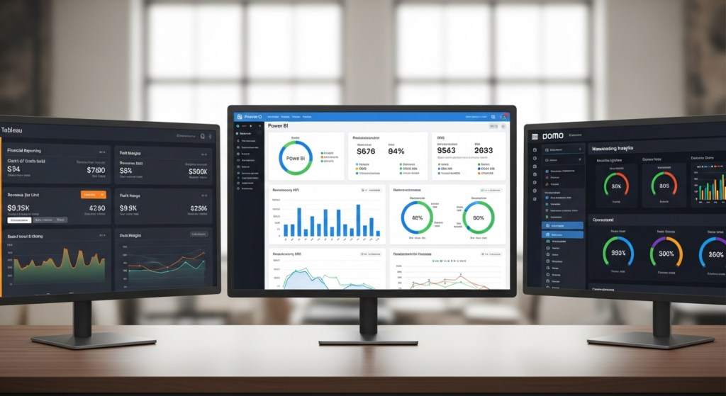
Investing in the right data visualization tool solves this problem, translating into massive cost savings, pristine financial reporting, and optimized key performance indicators (KPIs). In this guide, we will compare the top three market leaders—Power BI, Tableau, and Domo—to help you make a highly informed purchasing decision.
Buyer’s Guide: How to Evaluate Manufacturing Analytics Dashboard Software
Before comparing specific software platforms, it is crucial to understand what makes an analytics tool effective for a manufacturing environment. Not all visualization tools are built to handle the rigorous demands of the factory floor.
Here are the critical factors you must evaluate before making an investment.
Critical Manufacturing KPIs and Financial Reporting Capabilities
Generic business intelligence tools often fail when tasked with complex industrial accounting. Your software must effortlessly handle dense manufacturing metrics alongside traditional financial reporting.
Ensure your chosen platform can accurately track and visualize:
- Material Yield Variance: The difference between the actual amount of material used and the standard amount expected.
- Overhead Absorption: How well manufacturing overhead costs are applied to the products being produced.
- Labor Efficiency: A measure comparing actual labor hours worked against the standard hours expected for a production run.
- Direct Material Costs: The total cost of all materials directly traced to the creation of a specific product.
ERP, MES, and IoT Integration
Your data is only as good as the systems your dashboard can seamlessly talk to. Out-of-the-box connectors are pre-built integrations that allow different software systems to share data instantly without requiring custom coding.
Relying on expensive, custom-developed API connections for every machine is a recipe for budget overruns. Your dashboard must offer native connectors for major ERPs such as SAP and Oracle, as well as Manufacturing Execution Systems (MES) like Plex. Furthermore, it should easily ingest data from factory-floor IoT sensors to monitor machine health in real-time.
Data Governance and Security on the Shop Floor
A manufacturing facility requires highly specific data access protocols. Floor supervisors need granular operational data to manage daily shifts, while C-suite executives require high-level financial roll-ups.
Your platform must feature robust role-based access control. Role-based access control (RBAC) is a security mechanism that restricts network access based on the roles of individual users within an enterprise. This ensures that operators see only the machine data relevant to their line, while sensitive financial reporting remains restricted to the finance department.
Total Cost of Ownership (TCO)
Software licensing fees are only the tip of the iceberg when budgeting for enterprise software. Total Cost of Ownership (TCO) is a comprehensive financial estimate that encompasses all direct and indirect costs of a product over its complete lifecycle.
When evaluating these tools, you must look well beyond the initial per-user license cost. Consider the hidden expenses of implementation consulting, specialized employee training, and ongoing IT maintenance. A cheaper initial license can easily become the most expensive option if it requires a dedicated team of developers to maintain.
Microsoft Power BI: The Heavyweight for the Microsoft Ecosystem
Microsoft Power BI has fundamentally disrupted the business intelligence market through its ubiquitous accessibility. It is a dominant force in corporate environments, deeply intertwined with the broader Microsoft technology stack.
Value for Money
Power BI operates on a highly aggressive pricing model that is incredibly difficult for competitors to beat. Because it is often bundled with existing Office 365 enterprise licenses, many organizations already have access to the basic version at no extra cost.
This creates the lowest possible barrier to entry for modern financial reporting. If your plant already utilizes a Microsoft tech stack, Power BI will almost certainly deliver the fastest initial return on investment (ROI).
Pros and Cons
While powerful, Microsoft’s solution is not without its specific quirks and limitations.
- Pros:
- Seamless, native integration with Excel, Azure, and Teams.
- Massive global community support and highly accessible training resources.
- Extremely cost-effective for enterprise-wide deployment compared to standalone tools.
- Powered by DAX (Data Analysis Expressions), a highly robust formula language perfect for complex financial modeling.
- Cons:
- Can become notoriously sluggish and unresponsive when handling massive, unoptimized datasets.
- The user interface for desktop developers can feel cluttered and clunky.
- Requires specialized, in-depth DAX knowledge to build highly advanced custom KPIs.
Who This Is For
Power BI is the ultimate choice for manufacturers already heavily invested in the Microsoft ecosystem. If you are using Azure data lakes, Dynamics 365, and Teams, it integrates flawlessly. It is highly recommended for organizations seeking for a budget-friendly, highly scalable solution for plant-wide operational reporting.
Tableau: The Gold Standard for Deep Visual Analytics
Acquired by Salesforce, Tableau earned its legendary reputation by completely changing how users interact with data. It treats data visualization as an art form, prioritizing deep analytical exploration over simple, static reporting.
Value for Money
Tableau features a premium pricing structure that reflects its status as an elite analytical tool. While the upfront licensing costs are significantly higher than Power BI, the return on investment can be astronomical for the right team.
The higher cost is justified by its unparalleled visual data exploration capabilities. By allowing analysts to seamlessly slice and dice data, Tableau frequently unearths hidden manufacturing bottlenecks, saving millions in costs due to production delays.
Pros and Cons
Tableau excels at turning raw data into compelling stories, but it requires skilled hands to truly shine.
- Pros:
- Best-in-class visualization capabilities with highly customizable aesthetic designs.
- Highly intuitive drag-and-drop interface for building complex charts.
- Exceptional at handling massive, complex datasets sourced from multiple disparate factory locations.
- Cons:
- Noticeably higher licensing costs that can deter smaller manufacturing outfits.
- A much steeper learning curve for non-analysts attempting to build net-new dashboards.
- Less robust out-of-the-box data modeling capabilities compared to Power BI.
Who This Is For
Tableau is custom-built for enterprise manufacturers with dedicated, skilled data analytics teams. It is ideal for organizations that need to conduct deep-dive, ad hoc analysis on complex supply chain issues. If predictive maintenance and the analysis of complex financial variances are your top priorities, Tableau is your best bet.
Domo: The Cloud-Native Agility Engine
Domo represents a completely different approach to business intelligence. Rather than just a visualization layer, it is an all-in-one ecosystem designed to handle everything from data ingestion to final executive reporting.
Value for Money
Domo utilizes a premium, all-in-one pricing model that can initially induce sticker shock. However, it justifies this cost by combining data integration, storage, and visualization entirely within a single platform.
By doing so, Domo significantly reduces the need for heavy, expensive IT infrastructure. For many mid-sized manufacturers, the cost of Domo is entirely offset by the savings of not having to build and maintain a separate, external data warehouse.
Pros and Cons
Domo is built for speed and agility, though its closed nature poses challenges for some IT purists.
- Pros:
- Incredible speed of deployment, often getting plants live in a fraction of the traditional time.
- Over 1,000 pre-built connectors, making it exceptionally easy to tie into legacy manufacturing systems.
- An elite, highly functional mobile app perfect for plant managers walking the factory floor.
- Strong automated alerting systems that notify leaders of KPI drops instantly.
- Cons:
- Pricing can be prohibitively expensive for smaller, single-facility operations.
- Functions as a “closed ecosystem,” making it technically difficult to migrate away from it later.
- Offers less advanced custom visual formatting and charting options than Tableau.
Who This Is For
Domo is the definitive choice for agile manufacturers and operations executives who demand rapid deployment above all else. It is perfect for leaders who need real-time, mobile access on the factory floor without waiting for IT bottlenecks. If you want a platform that “just works” right out of the box, Domo is unmatched.
The Verdict: Which Software Drives the Best ROI for Your Plant?
Choosing between Power BI, Tableau, and Domo ultimately comes down to your organization’s existing infrastructure, budget, and specific data goals.
Here is our final breakdown of where each platform shines.
Best Value and Integration: Power BI
Power BI is our top recommendation for the vast majority of standard manufacturing operations. It focuses heavily on cost-control, seamless financial reporting, and leveraging existing Microsoft investments. If your primary goal is affordable, scalable reporting across multiple departments, Power BI is the clear winner.
Best for Advanced Data Discovery: Tableau
Tableau takes the crown for highly mature data organizations focused on deep, investigative analytics. It is the ultimate tool for uncovering complex supply chain inefficiencies and hidden production insights. If you have dedicated data scientists focused on optimizing factory operations, Tableau will yield the highest long-term ROI.
Best for Speed and Mobile Executive Visibility: Domo
Domo is the definitive winner for executives who need a fast, all-in-one platform without relying on a large IT team. Its mobile-first approach and real-time KPI alerts make it a favorite for floor managers who are constantly on the move. If speed to deployment and mobile visibility are your primary drivers, Domo is unmatched.
Final Purchasing Advice
Do not make your decision based on feature lists alone. We strongly urge buyers to use the free trials offered by all three of these providers.
Audit your current data warehousing infrastructure, involve your floor managers in the trial process, and align your software choice with your primary financial reporting goals. A tool is only as valuable as the adoption rate of the team actually using it.
Frequently Asked Questions (FAQ)
What is the typical ROI of manufacturing analytics dashboard software?
The return on investment for these tools is typically achieved through drastic reductions in machine downtime and lowered Cost of Goods Sold (COGS). By automating financial reporting and supply chain tracking, manufacturers also eliminate hundreds of hours of manual administrative work. Many facilities see a full return on their software investment within the first six to twelve months of deployment.
Can these platforms connect directly to machines on the factory floor?
Analytics dashboards generally do not plug directly into legacy hardware or individual physical machines. Instead, they connect to intermediate data-collection layers like IoT gateways, SCADA systems, or your plant’s Manufacturing Execution System (MES). SCADA (Supervisory Control and Data Acquisition) is an industrial control system used to gather and analyze real-time operational data.
How long does it take to implement a manufacturing KPI dashboard?
Implementation timelines vary wildly based on the cleanliness of your existing data. If your data is clean and modernized, you can have basic operational dashboards running in Domo and Power BI within a few weeks. Conversely, highly complex, enterprise-wide Tableau deployments involving messy legacy data can take several months to fully implement.
Do I need a data warehouse to use these tools?
It depends entirely on the volume of your data and the specific tool you choose. Platforms like Power BI and Tableau typically require a separate, robust data warehouse (such as Snowflake or Amazon Redshift) to efficiently process large-scale manufacturing financial reporting. However, platforms like Domo offer built-in cloud storage, often eliminating the immediate need for an external data warehouse.